
The General Information aspect is one of the service aspects that cannot be removed from a configuration. It is advisable to fill in as much of this as possible and as is relevant. The panel for this in the application looks like the figure below.
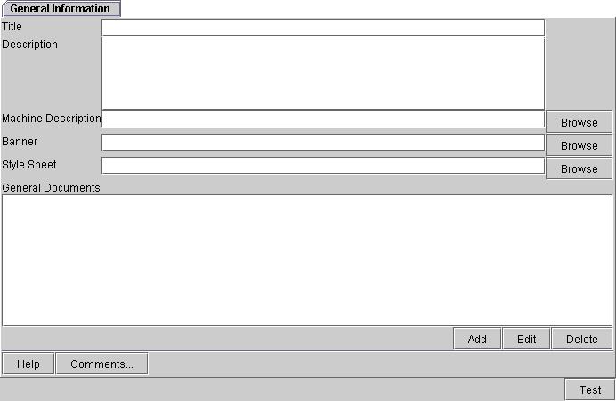
Title: The title of the services being configured. Note that this is not the same as the file name under which you would save a configuration.
Description: A description of the services you are designing.
Machine Description: Allows you to specify a machine readable description of services primarily for bioinformatics platforms. Note that this hasn't been tested in production settings yet.
Banner: An image that you can use for the web page deployment. Note that his banner will only be applicable to the web page generated and not to the other front ends. Clicking the Browse button brings up a file search dialog.
Style Sheet: A style sheet can be used to help customise aspects of web pages such as font, text colours, etc. The style sheet is only used to alter the appearance of the web application deployment.
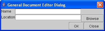
General Documents: This is for attaching any documents that may be relevent to the services you are designing. This list will be expressed in two of the deployments. In the web application, the documents will appear as hyper links on the left-hand side bar. In the standalone application, the documents will appear as menu items in the "Help" menu. Clicking the Add button allows you to add a document with the pop up dialog appears as shown below. On this pop up dialog, clicking OK saves the entries and closes the dialog while Close closes the dialog without saving any values entered since the last time saved. The Browse button allows you to choose the place from where you want to get the desired file.
By selecting a document listed in the list on the tab, you can change it by clicking Edit or remove it by clicking Delete.
Help: Clicking this button brings up a window with help on filling in the given tab.
Comments...: clicking this button allows you to add specific comments for this tab (check if this is per tab or for the whole service design). A dialog will appear like the one shown below.
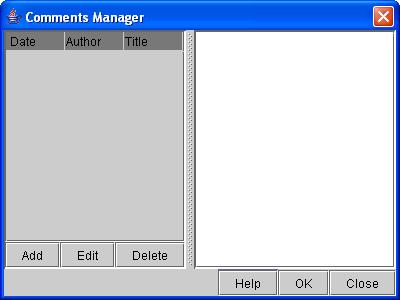
The left hand side will list the comments that have already been added while the right hand side will display the comment that you have selected from the left. To add a new comment, click Add and a second dialog will appear like the one below. Selecting a comment on the left hand side and clicking Edit will allow you to change an existing comment while clicking Delete will remove it from the list. Clicking Help brings up a window with information about filling in the dialog. To close the dialog and save your changes, click OK. To close the dialog without saving any changes, click Close.
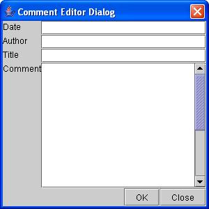
This dialog allows you to enter information for Title, Author, Date, and Comment. To close the dialog and save your changes, click OK. To close the dialog without saving any changes, click Close.
Test: Clicking this button will generate a sample front end application with the current values in the service design. Note that this test front end will look like the Java application and will not provide you with samples of the other front end deployments.